Design Thinking: Multi-family Facades
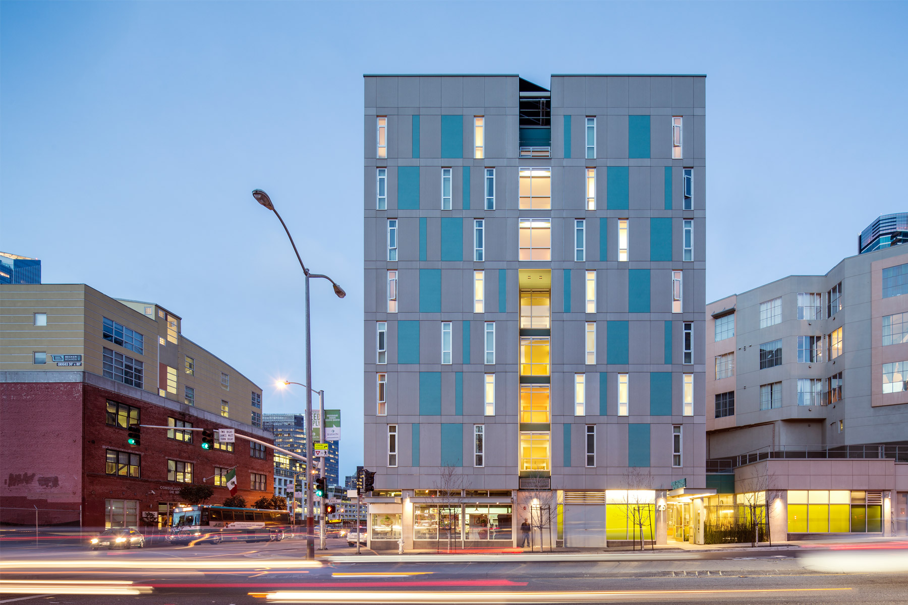
Designing for density, particularly on tight urban infill sites, is a real challenge. Planning rules, building codes, and internal access to light and air present a formidable design puzzle. Following the recent design completion of four multi-family projects in our office, we thought we would revisit the formal structure of some of our recent projects.
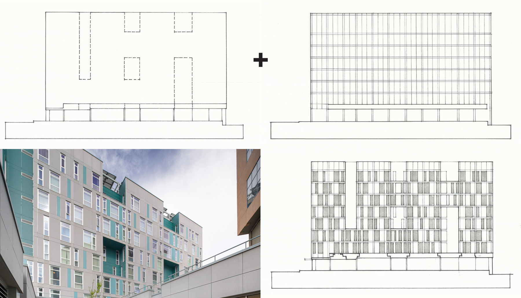
Some of the tools we use to tackle the design of the facade are offset rhythm and patterns of windows, bold cutouts, and color variation. Often these strategies are combined or layered to maximize variation and to create visual interest. For example, Rene Cazenave Apartments (RCA), which occupies an urban site adjacent to the Bay Bridge freeway exit into San Francisco, is designed to create a distinct urban experience through the composition of the facades. The structural bay is divided into three parts along Folsom Street. Two sizes of windows shift along the grid. Overlaid on this system, a pattern of notches cut through both sides of the facade, punctuating the active skin and providing a larger rhythm of openings across the building.
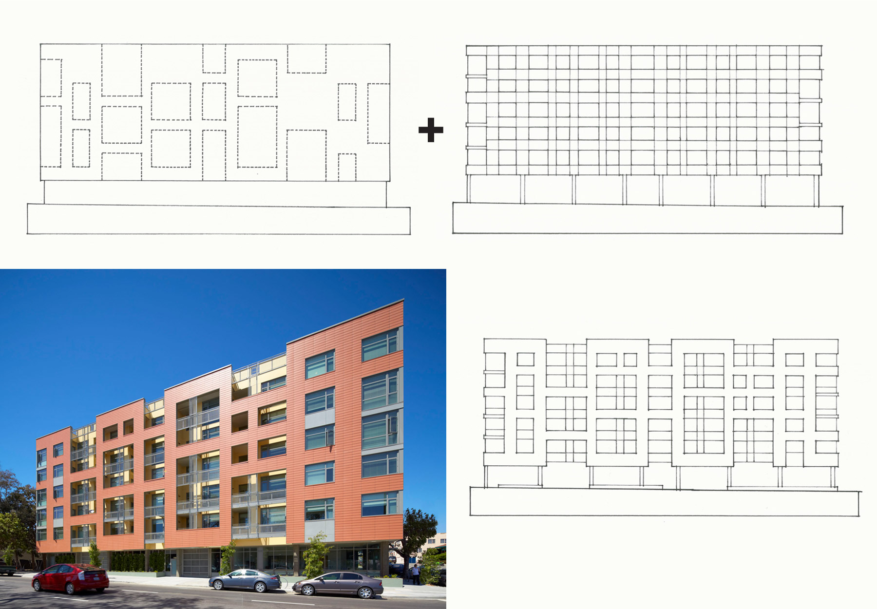
Merritt Crossing in Oakland is also located next to a freeway at an urban brownfield site. Similar to RCA, the design of Merritt Crossing leverages cutout facade to provide the larger rhythm across the building skin. Unlike RCA, Merritt relies on layering the cutout facade over a "tartan grid" of panels and windows. Sometimes the cutouts correspond to the tartan grid beneath and sometimes they encompass several bays, a pair vertically or a group of four. Because the facade reads in two planes instead of one, additional depth, visual variety, and shadow lines strengthen the formal structure of the exterior. The layered facade provides a visual and acoustical buffer from the freeway.
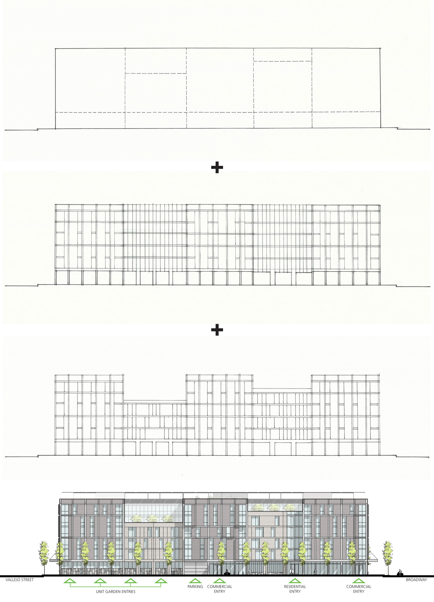
Our most recent project to complete design, 88 Broadway, is located on the last undeveloped lot of the former Embarcadero Freeway in San Francisco. The site is considerably longer than many of our other project sites, informing the composition of the final facade design. Due to its location in the Northeast Waterfront Historic District, we studied articulating the facade into 5 discreet pieces to mirror the neighborhood pattern of larger concrete frame and infill warehouse buildings nestled next to shorter brick bearing wall buildings. The grid of floor and window relationships weave through the facades in alternating bands.
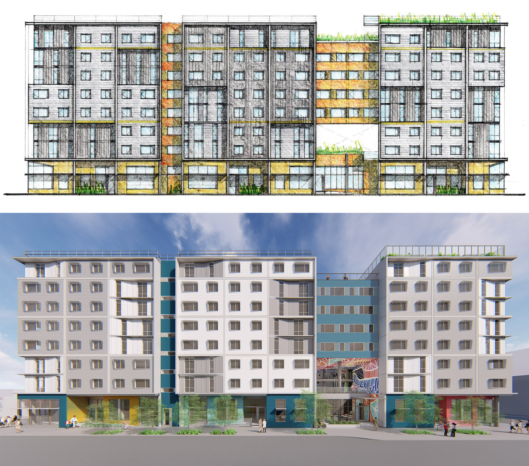
Our project on Folsom Street in the Mission District is in a very different neighbor than the Broadway site, with a different neighborhood identity. Can you guess the formal structure acting on this facade?
Strong geometric rationales give our projects a clear baseline from which a variety of materials and identities can be superimposed on a singular building type.